Text Visualization
LIS 4/5693: Information Retrieval and Text Mining
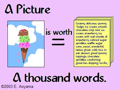
A Picture Is Worth a Thousand Words
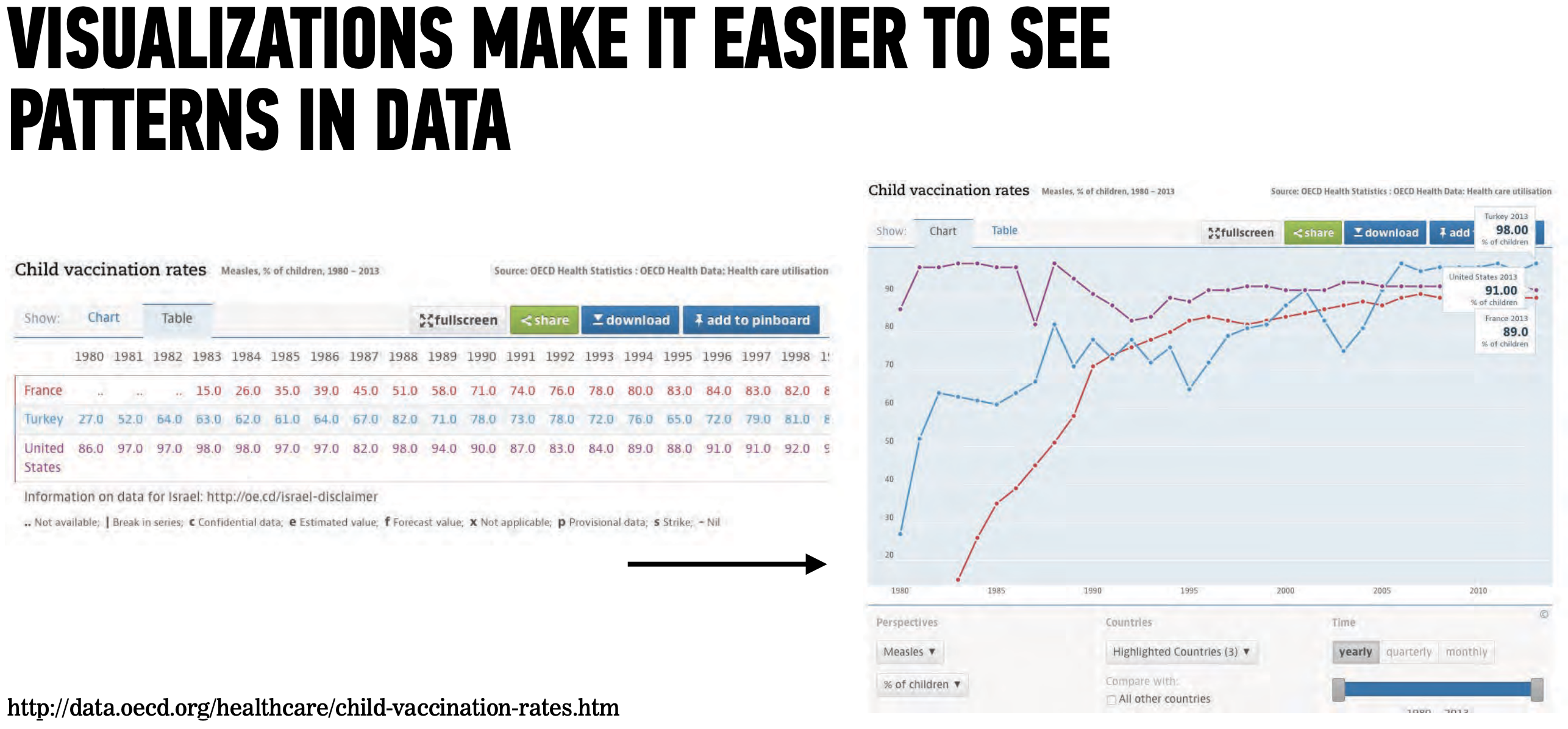
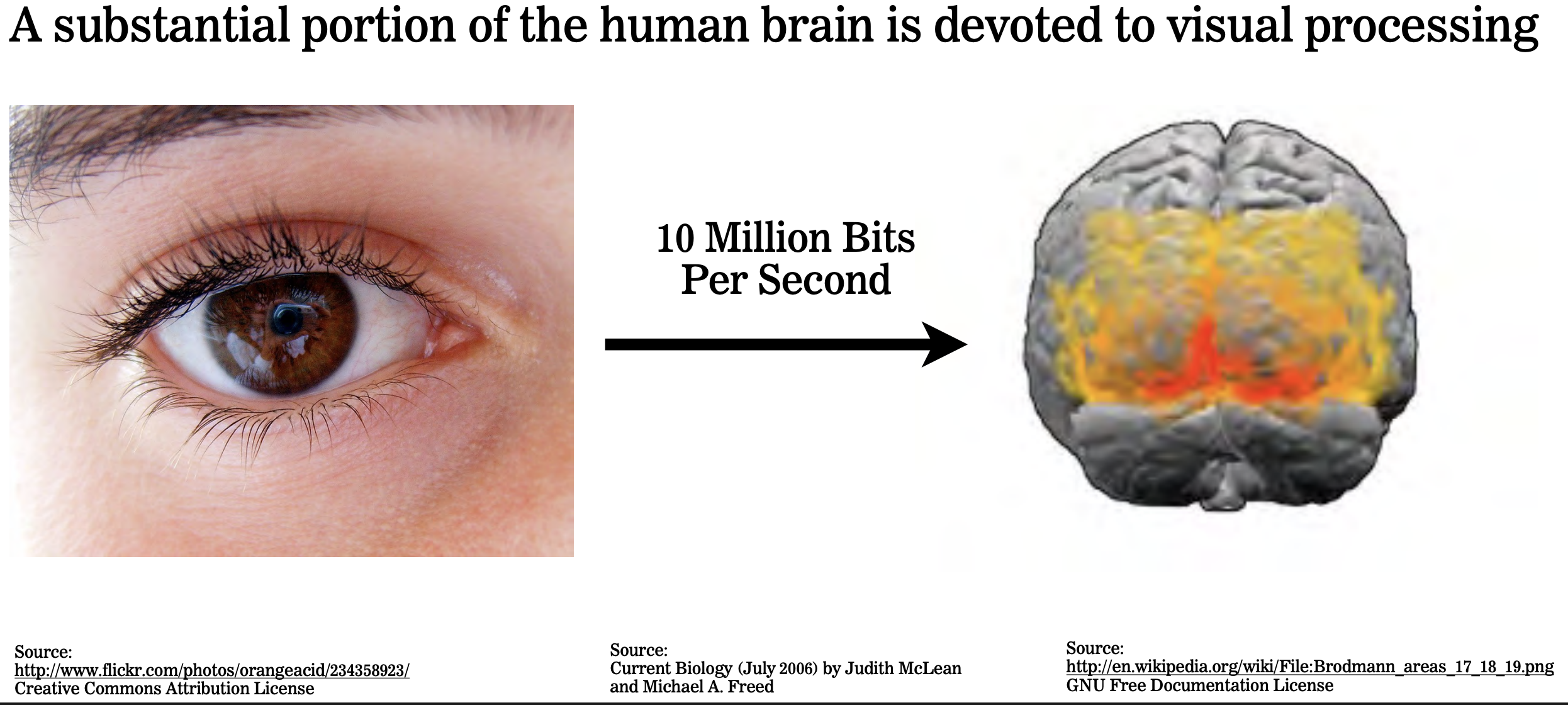
Our brains have been evolved to be very efficient in visual analysis
Visualization helps us to:
absorbs information quickly
connect the dots
find patterns and outliers
acquire & share insights
attract audience
![]()
Why Create Visualizations Generally?
Most information visualizations are acts of interpretation masquerading as presentation. In other words, they are images that act as if they are just showing us what is, but in actuality, they are arguments made in graphical form (Johanna Drucker)
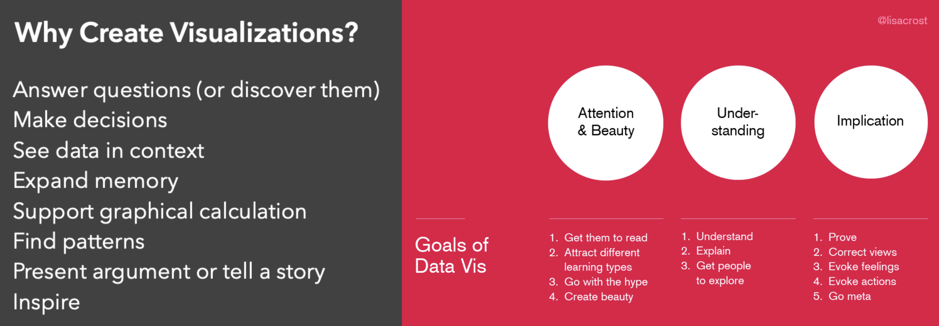
Why Create Visualizations Generally?
We are Wired for Visualization
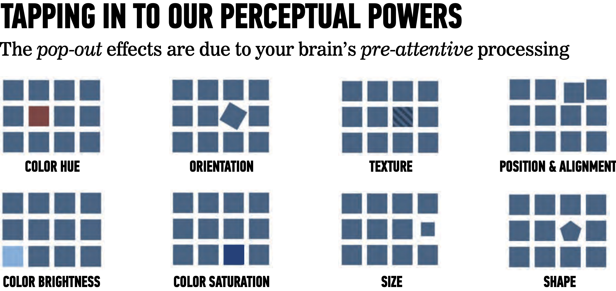
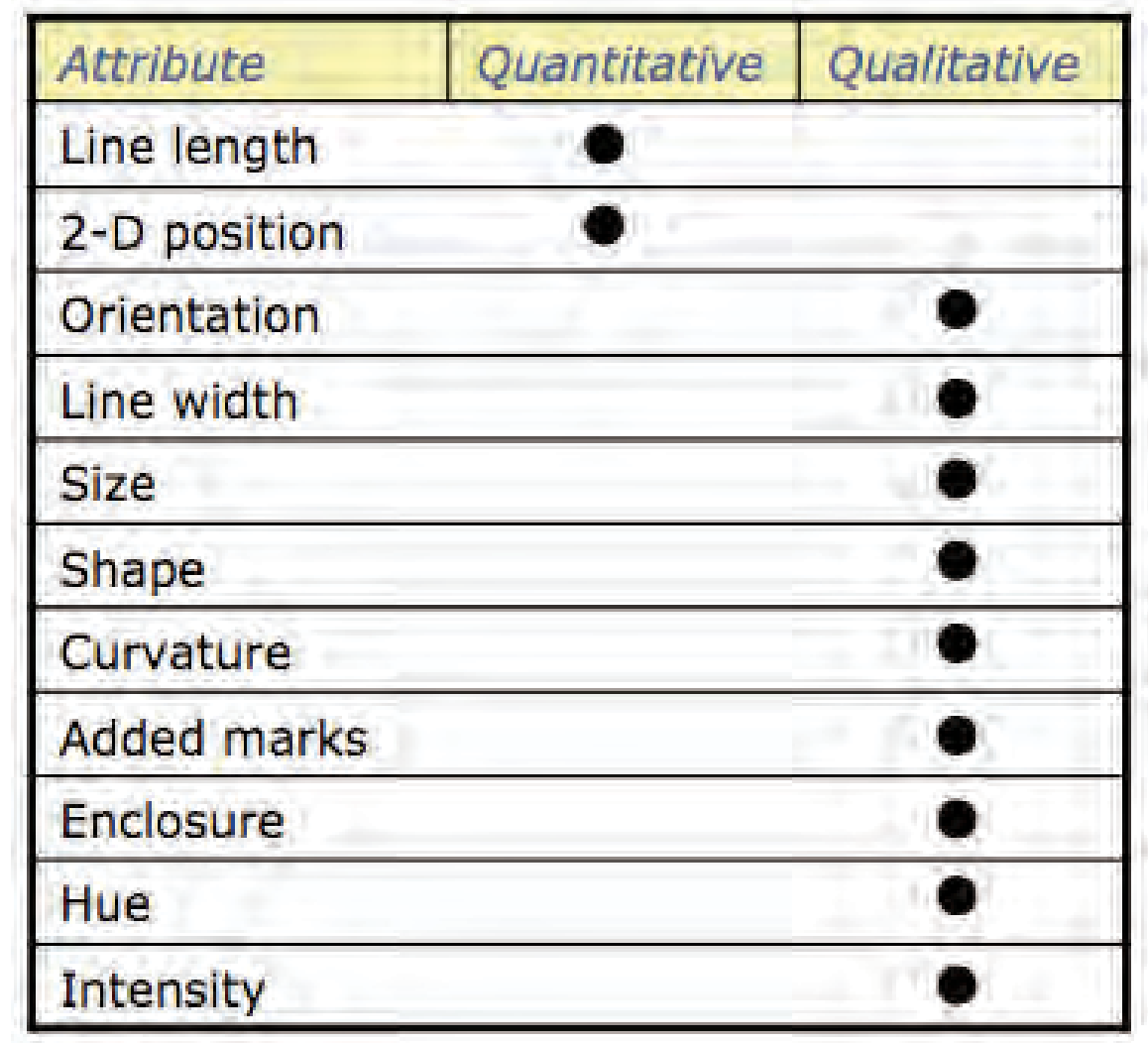
How Encoding Works?
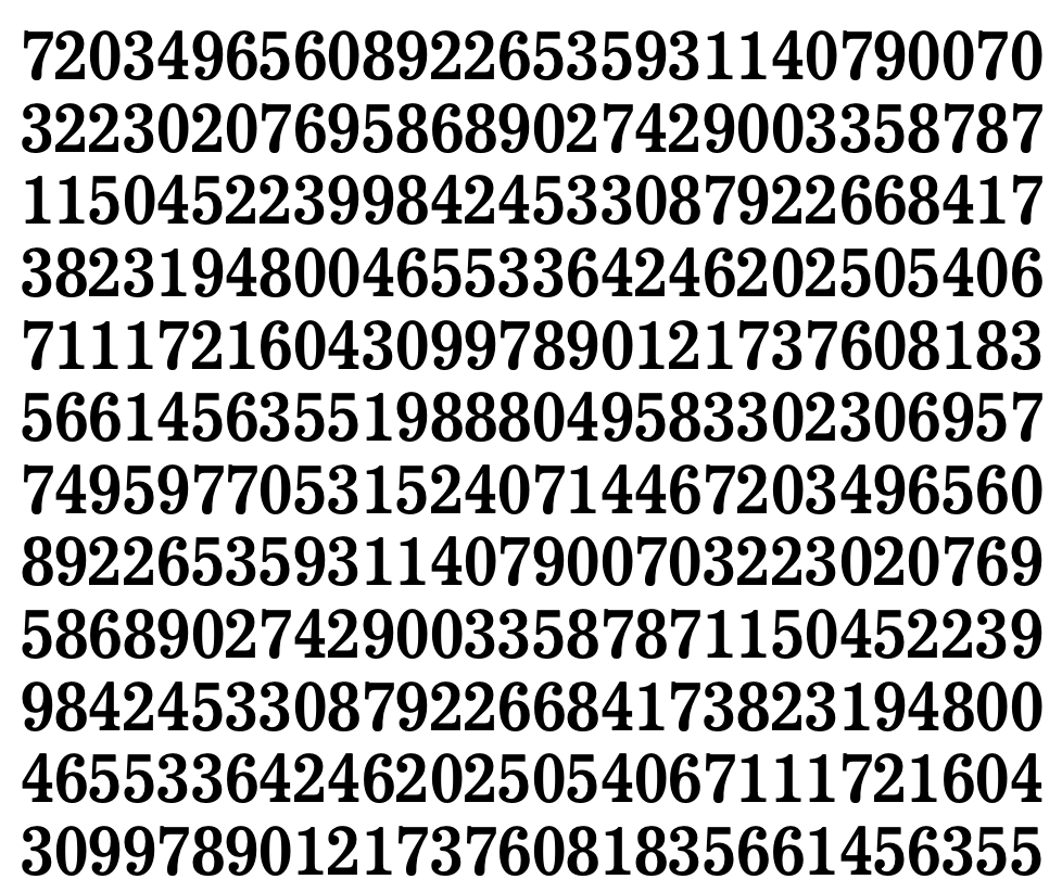
Guess how many ‘7s’ there are in this set
How Encoding Works?
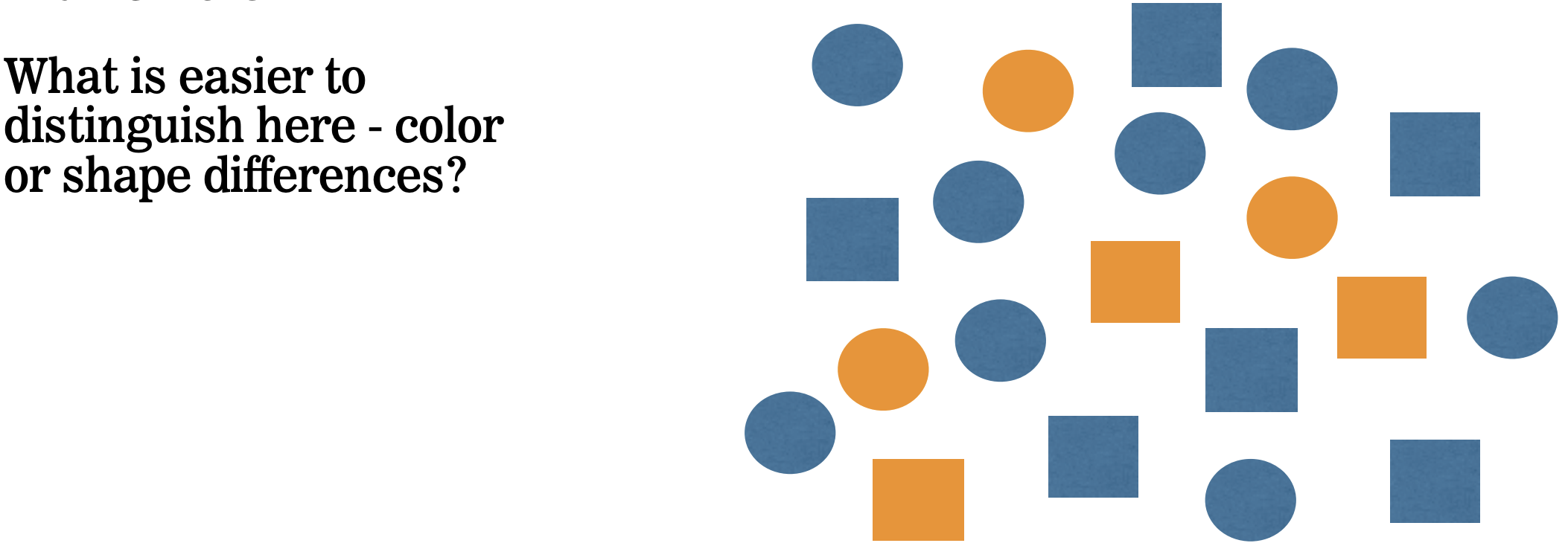
Effective visualizations require thoughtful encoding
Design decisions have a big impact on what people will see in the data
Now, try guessing again.
They are the same set of numbers but now the 7’s pop out to us.
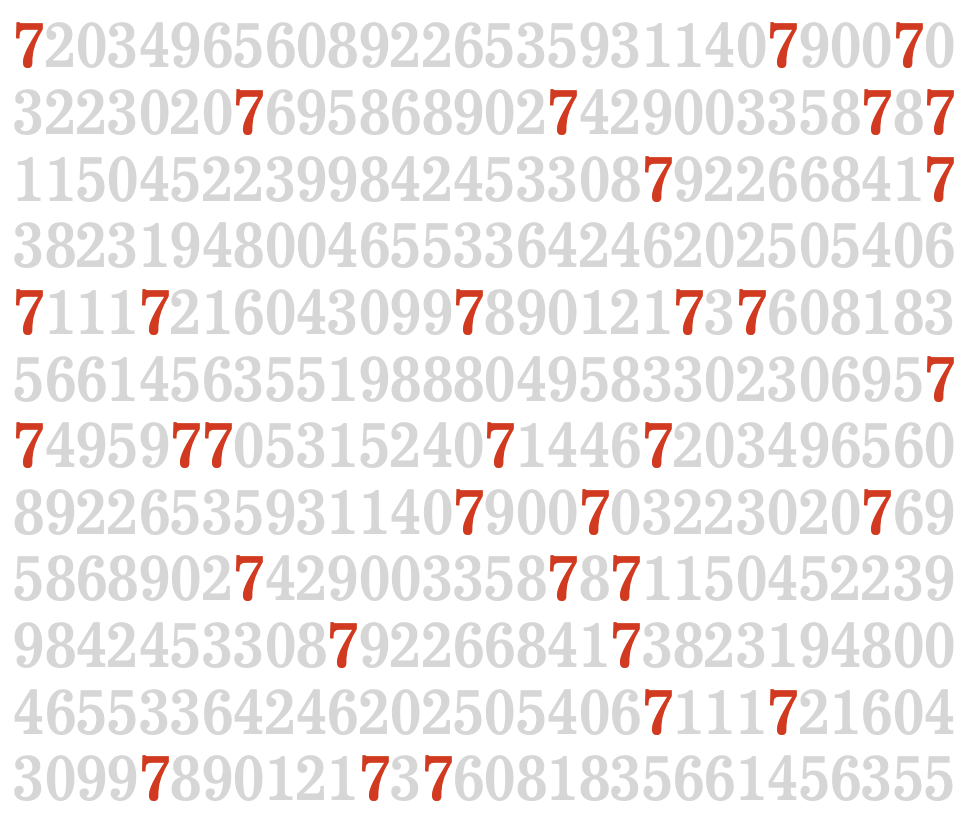
Some attributes pop out more than others
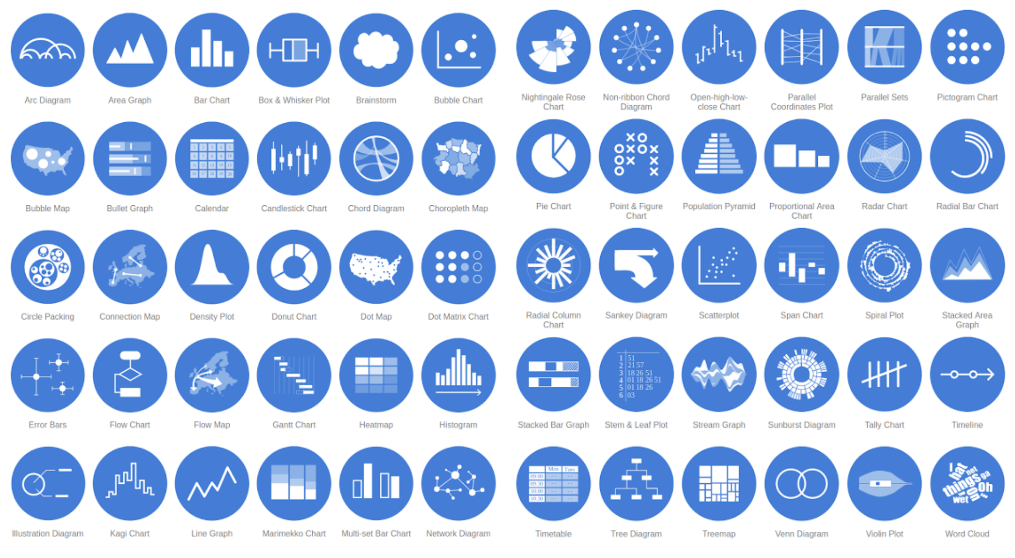
Types of Visualizations
One-Variable Graph
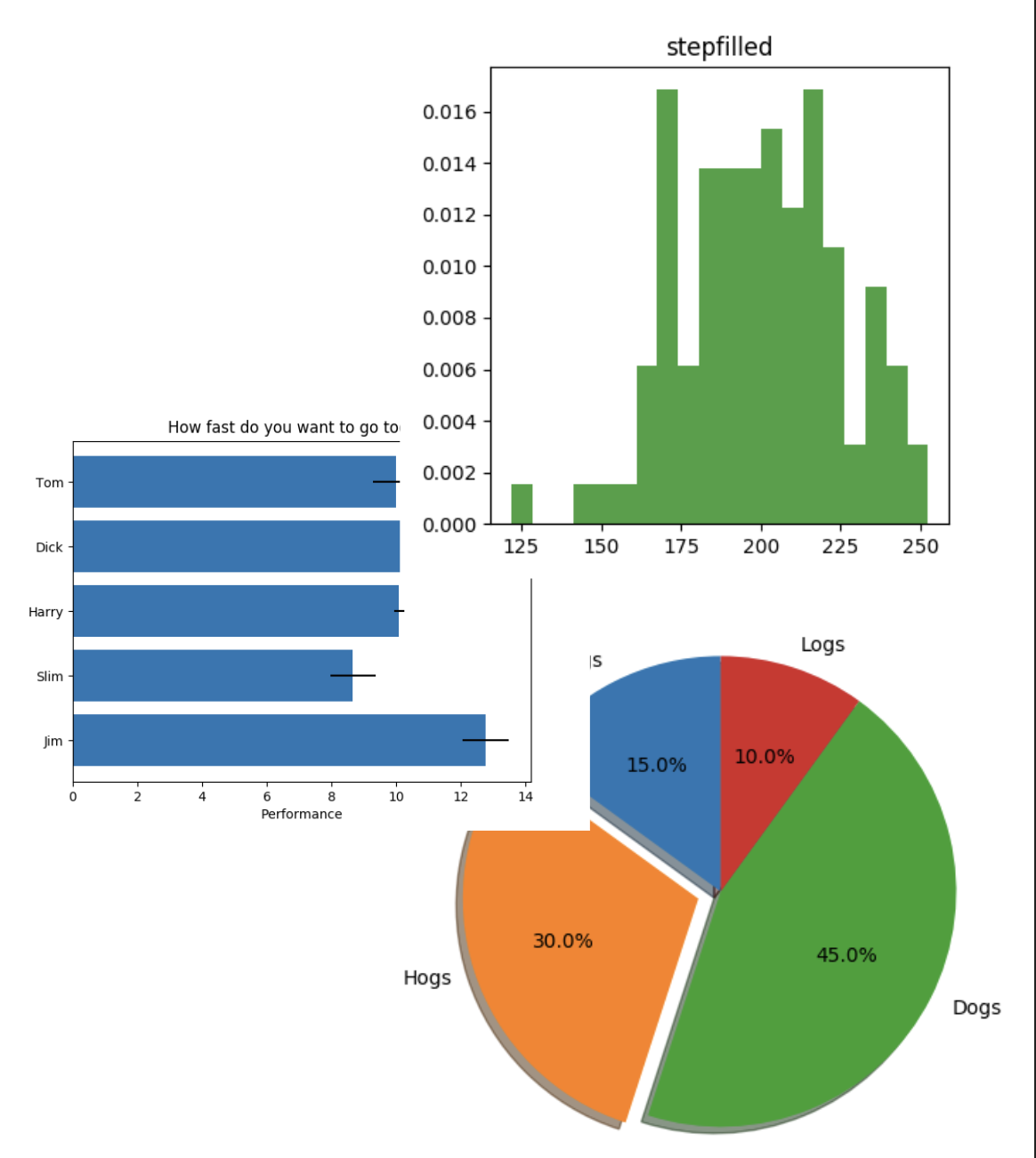
Histogram shows distribution and concentration of data
Bar Plot compares the same variable across different groups and shows how the data distributed among the groups
Pie Chart shows the groups of what your data is made, allows you to see the most and least as well as everything in-between, and shows the distribution of the data among groups
Two-Variable Graph
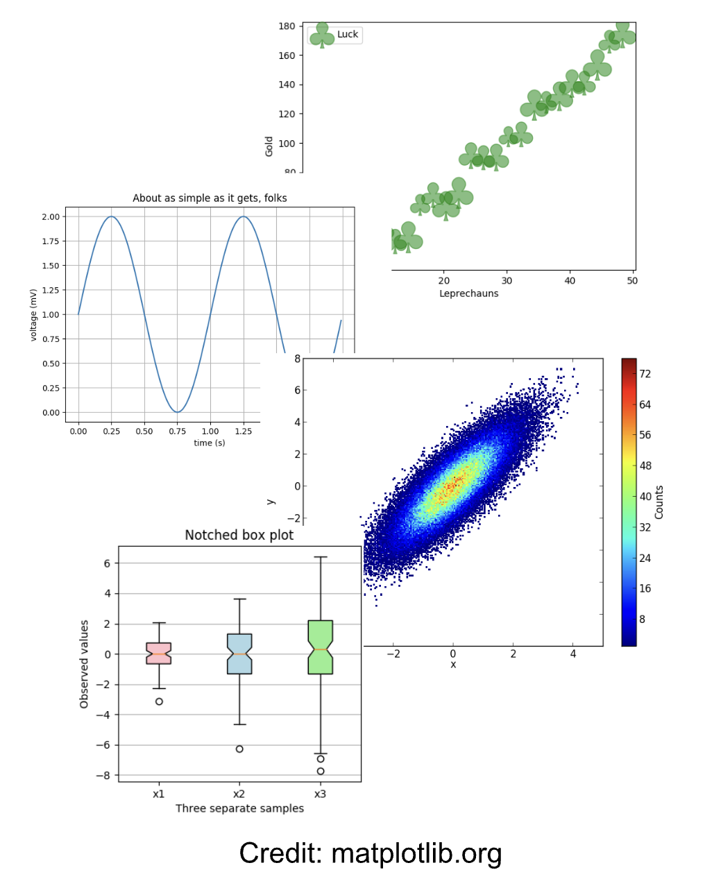
Scatter Plot shows all the data on the plot, you can see the distribution, correlations, and the spread of the data between two variables
Line Plot similar to scatter plot but the points are connected, make it easier to see the trends and evolution
2D Histogram shows distribution of two variables related to each other
Box or Whisker Plot shows spread of data and statistical information
Three Variable Graph
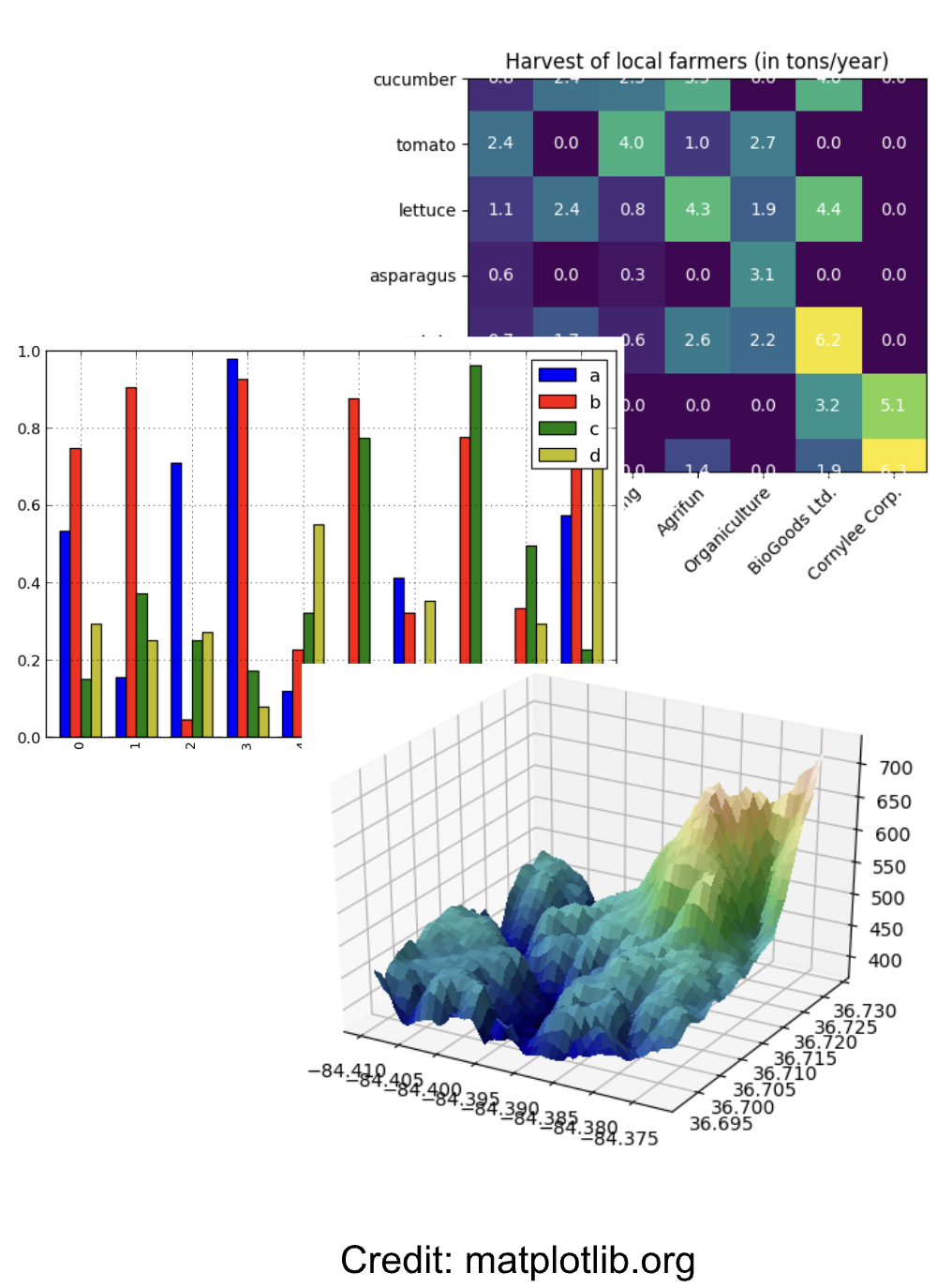
Heatmap shows two variables and other quantity (amount, intensity, height) with a colormap
Multiple-variable bar plot shows multiple variables for multiple groups
3D Plot shows the 3rd variable on surface in 3D plot
For high-dimensional datasets, applying the t-Distributed Stochastic Neighbor Embedding (t-SNE) algorithm and alike to reduce the dimension.
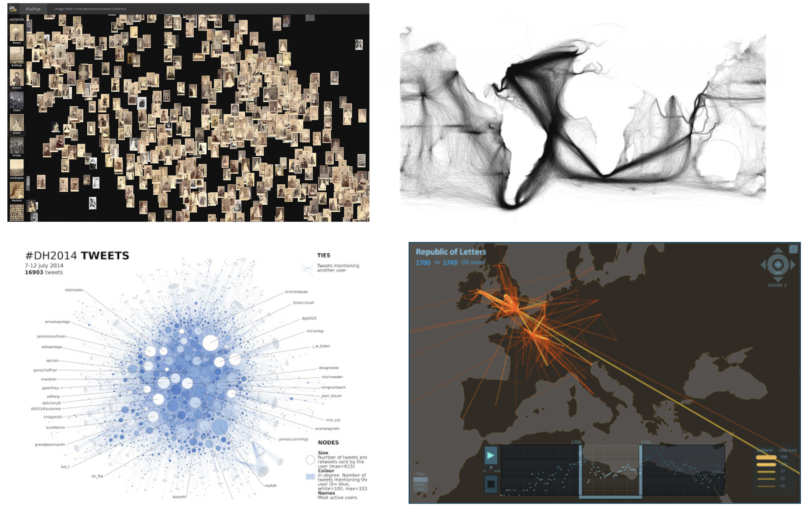
Some Examples
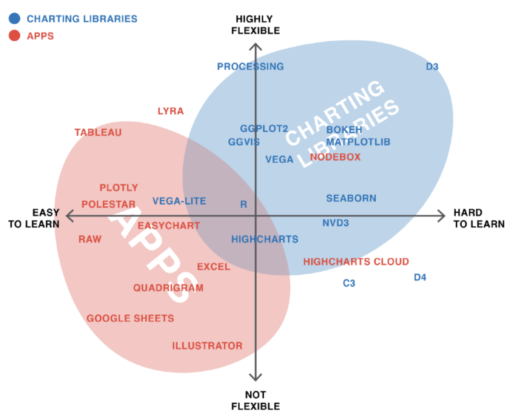
Ecosystem of Data Visualization Tools
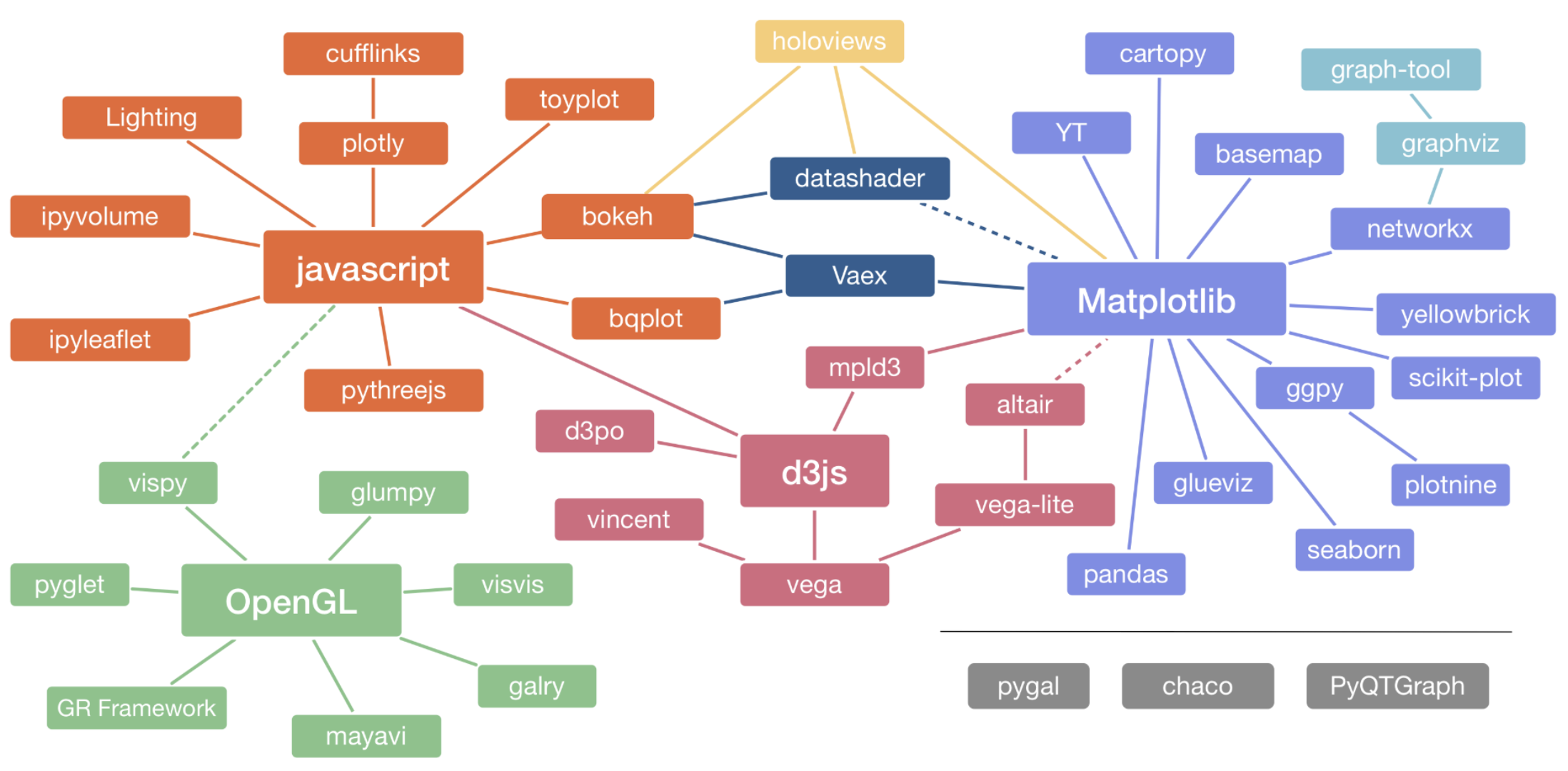
Python Visualization Landscape
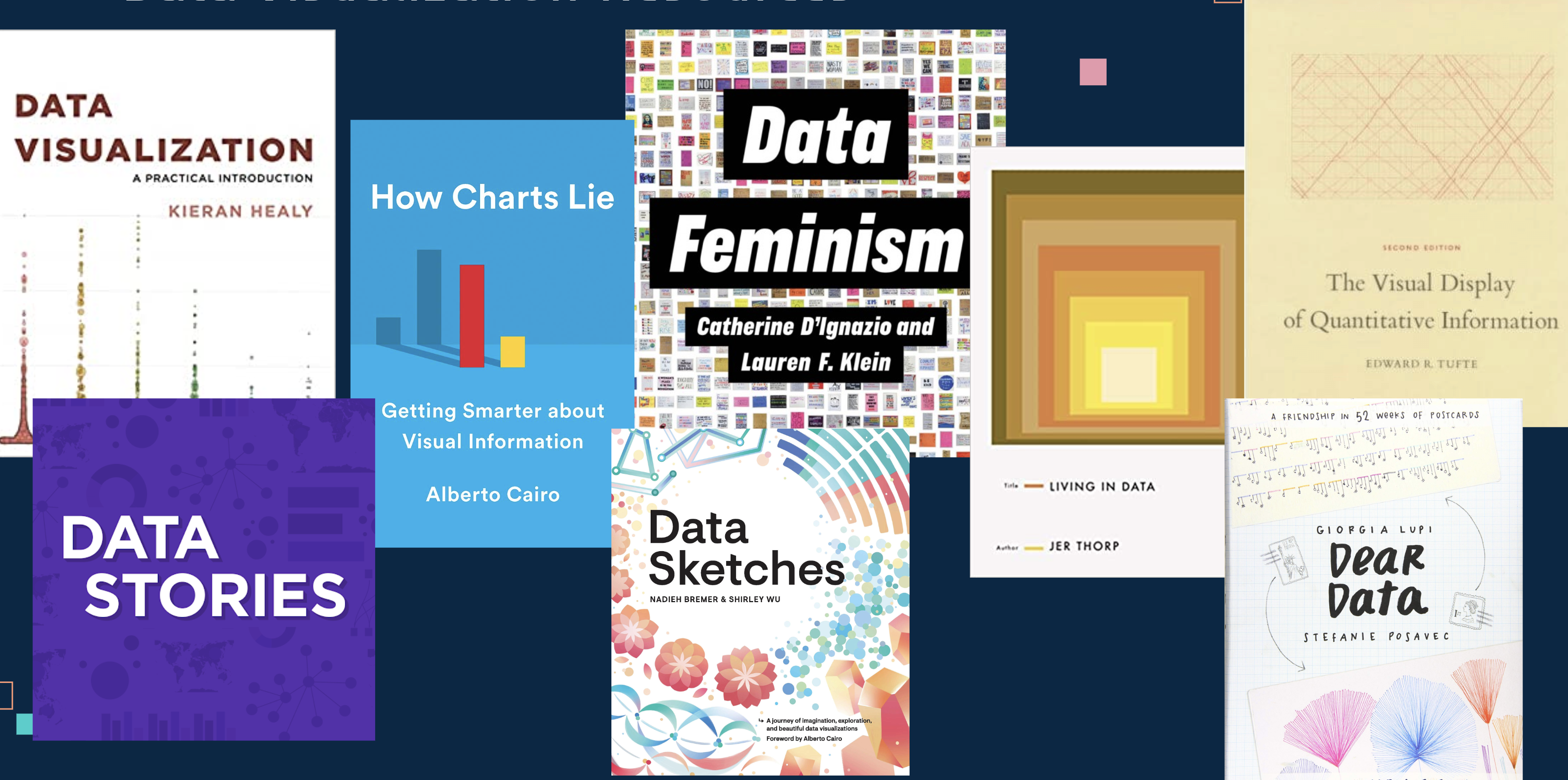
Data Visualization Resources
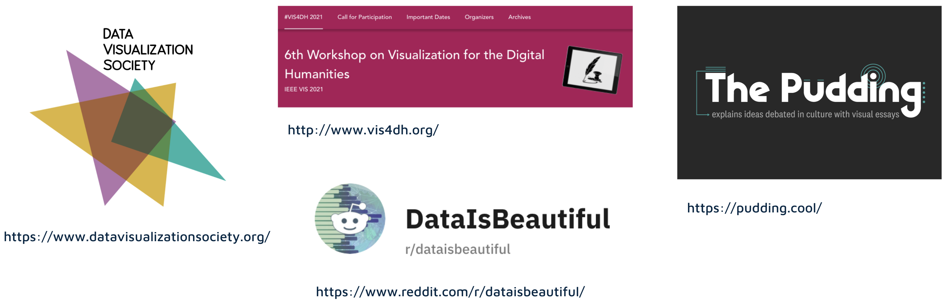
Data Visualization Resources